Building a shared design language for ALU's digital products
Creating reusable patterns to bring consistency to a fragmented student experience.
The challenge
ALU's student information system had grown inconsistent over time.
Development was supported by an external team, and the interfaces being built didn't always reflect ALU's brand or follow a consistent interaction language. Similar elements could look or behave differently across the experience, making the system harder for students to navigate and understand.
The challenge wasn't simply to redesign individual screens. I wanted to create a shared foundation that could help designers and developers build more consistent ALU experiences over time.

01. Identifying the consistency problem
The work started with a recurring problem: student-facing interfaces didn't always feel like parts of the same product ecosystem.
With development happening externally, brand guidelines alone weren't enough to define how digital interfaces should look and behave. Common UI elements needed clearer patterns that could be reused rather than interpreted differently each time.
This reframed the problem for me:
How could we translate ALU's brand into a practical system for building digital products?
02. Translating brand into interface foundations
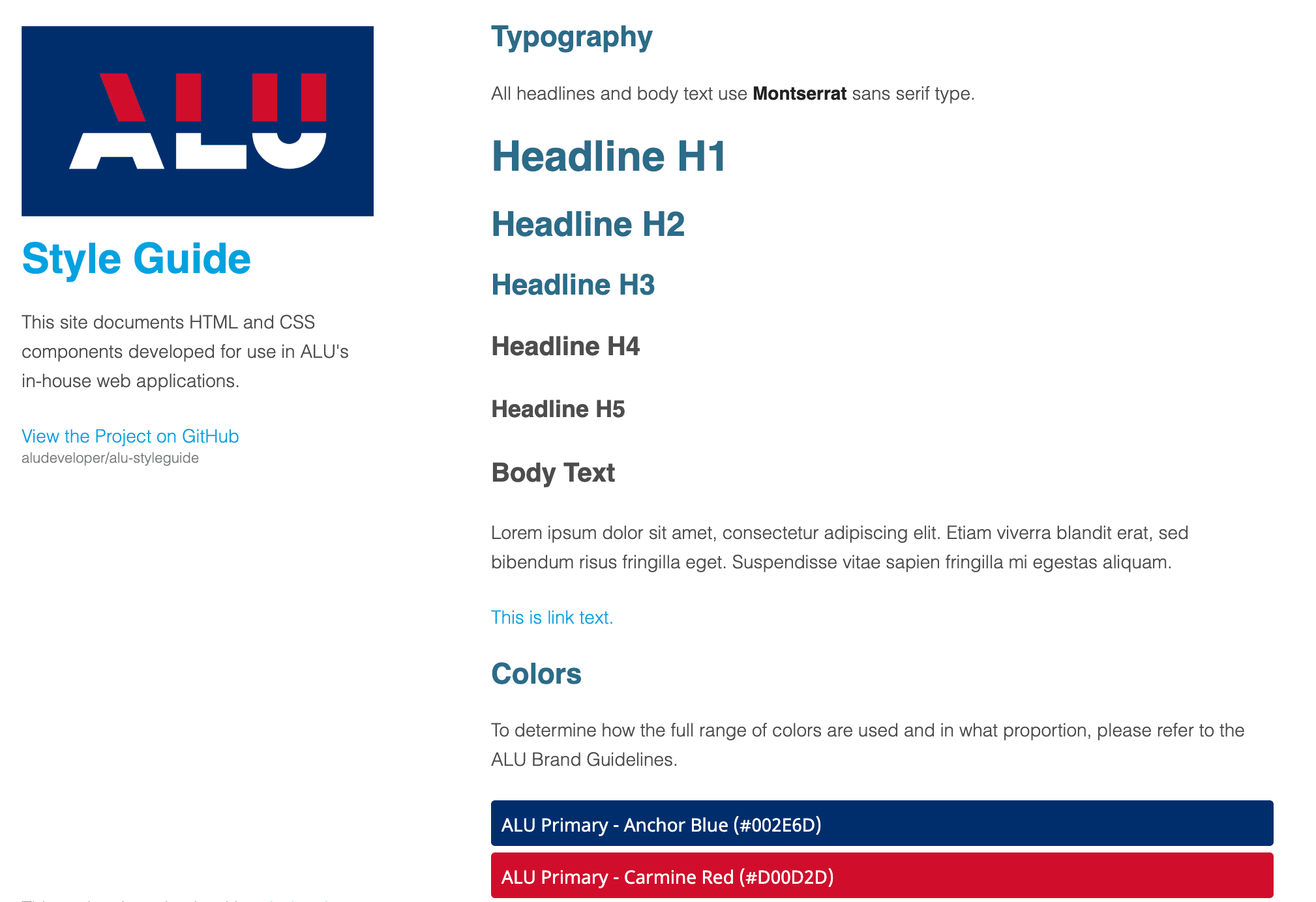
The system needed to feel recognisably ALU while also working as a practical interface toolkit.
I translated the existing brand language into foundations that could be applied consistently across digital products, including typography, colour and basic interaction patterns.
The goal was to move from a brand that described how ALU should look to a system that also helped define how ALU products should behave.
03. Creating reusable interaction patterns
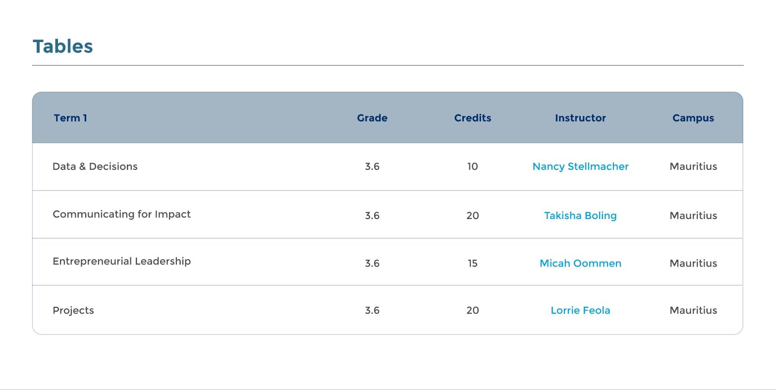
From those foundations, the system expanded into reusable components and interaction patterns.
Rather than defining only how components looked, the documentation also described their states and when different patterns should be used.
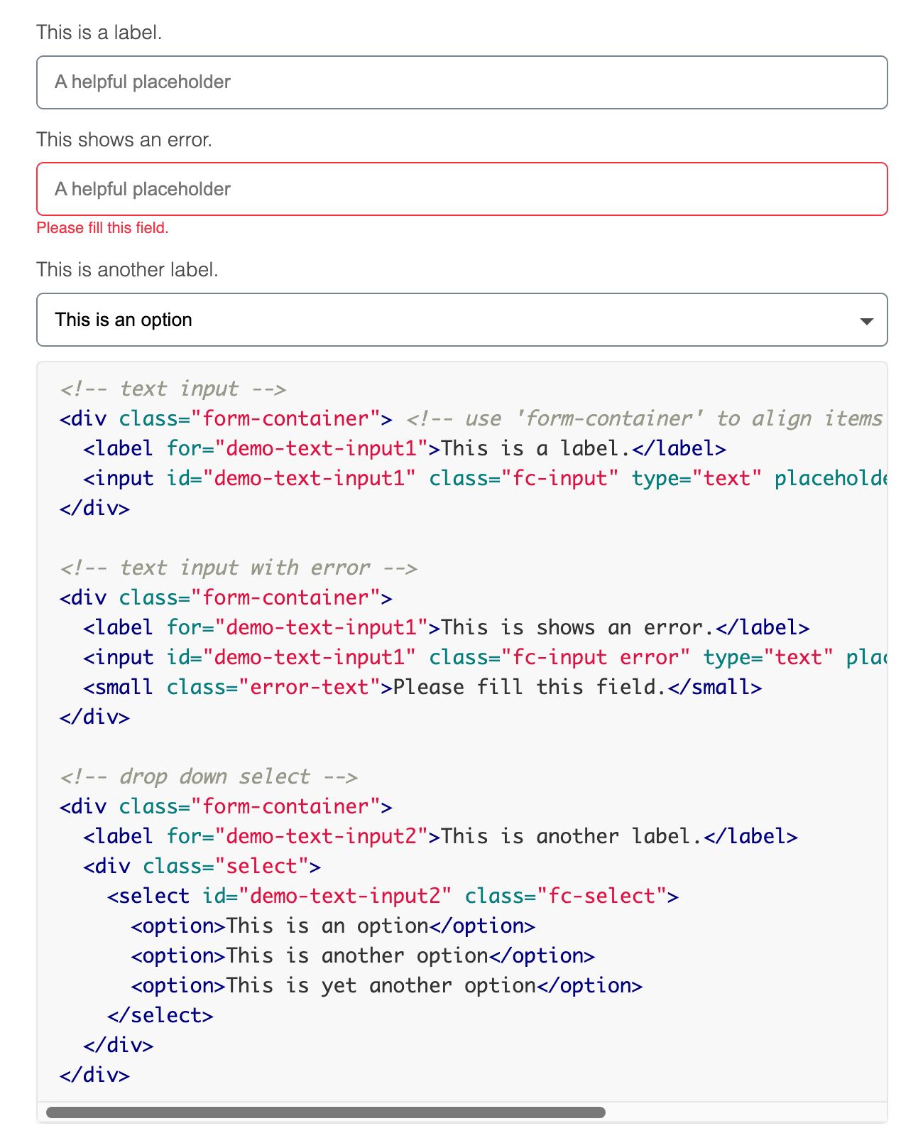
For example, button guidance distinguishes primary, secondary, success, warning, danger and icon-button patterns, including default, active and disabled states. Forms include inputs, selects, validation, radio buttons and checkboxes. (aludeveloper.github.io)
That made the system more than a visual reference. It began establishing shared interaction conventions.



04. Designing guidance, not just components
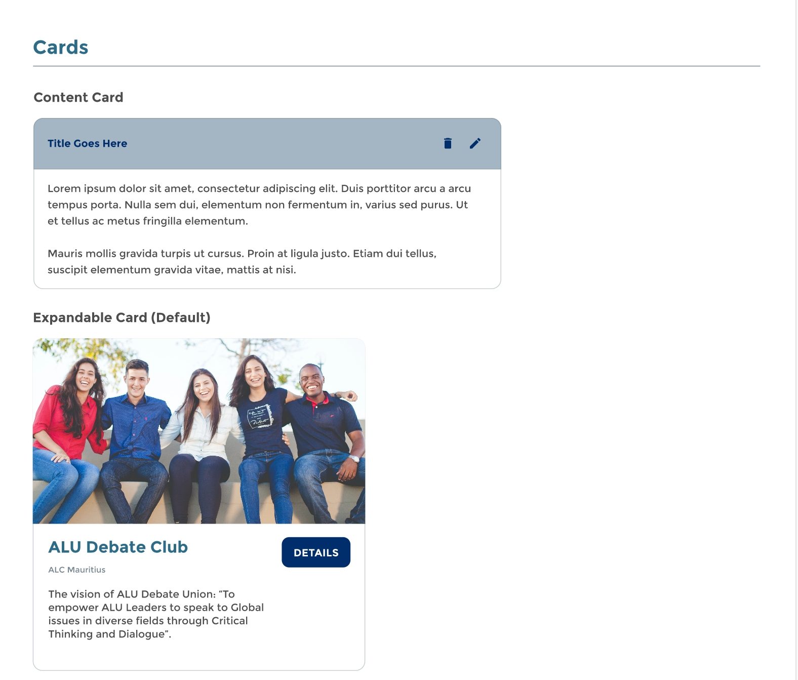
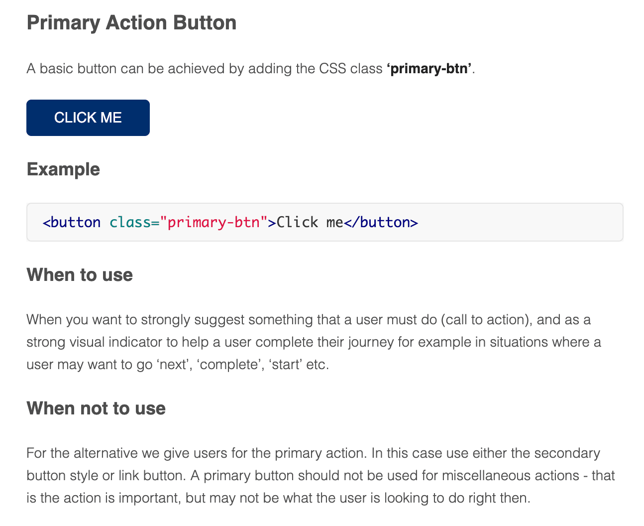
The guide doesn't stop at showing components, it also explains when patterns should and shouldn't be used. For example, the primary button documentation explains when an action deserves primary emphasis; card guidance discusses when cards are appropriate versus lists; and notification guidance distinguishes action-required feedback from passive information. (aludeveloper.github.io)
The aim was to give teams enough guidance to make consistent choices even when I wasn't involved in every implementation.
05. Bridging design and implementation
Because developers needed to apply these patterns in real products, the system couldn't live only in a design file.
The style guide documented implementation patterns alongside the visual guidance, giving developers reusable HTML and CSS references for common interface elements.
That created a bridge between the intended experience and the code used to build it.
06. Creating a foundation others could build on
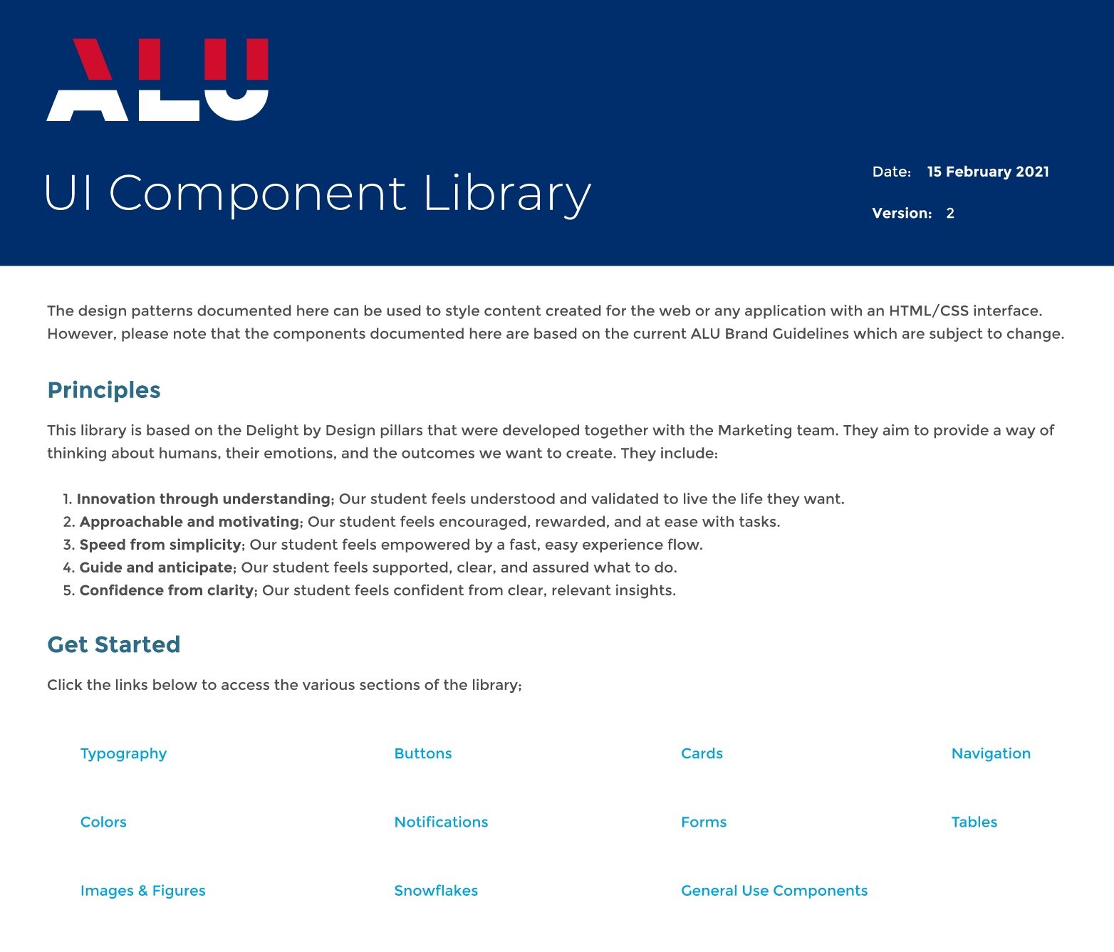
The work established a shared foundation for translating ALU's brand into reusable digital patterns, with resources for both designers and developers to extend the library.
More importantly, it shifted the solution away from fixing inconsistencies one screen at a time toward creating a system that could help prevent them from being introduced in the first place.
Reflection
Consistency isn't created by making every screen yourself. It's created by giving other people the tools to make consistent decisions.
Working on the design system changed how I thought about product design. Instead of solving the interface in front of me, I had to think about patterns that could work across products, use cases and teams.
It also showed me that a design system sits between disciplines: the design has to express the brand and support users, but it also has to be practical enough for developers to implement and extend.